According with WDL for 2011 we have 11 trends to follow as Web Designers and to destroy as Web Artists. Let’s take a look of it.
Web Design Trends in 2011
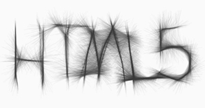
1. More CSS3 + HTML5
In 2011, you will slowly step away from Flash and embrace the magic known as HTML5. Look at the amazingly similar comparison:
 |
| http://mrdoob.com/projects/harmony/#longfur |
 | |
| http://www.zefrank.com/scribbler/scribblertoo/ |
However, HTML5 cannot (yet) replace the extraordinary design elements we can achieve through Flash.
Perhaps even more exciting is the fact that CSS3 is available to us in a real way this year.
2. Simple Color Schemes
Simplicity. Think of green, yellow or even red as your primary color. However, limit your palette to two or three colors. Work within the shades of each color for variety. It can be truly remarkable what a few colors can do for your message.
 Shades of green create this Twitter visualization tool. Side note: this site was created with XHTML/CSS and Javascript.
3. Mobile Ready
Smartphones, iPads, netbooks, oh my! There’s a dizzying amount of mobile products available to the consumer in 2011. This means your web design must be responsive to multiple viewports.
4. Parallax Scrolling
Parallax scrolling: not just for old school video games. As aforementioned, the hot web design trend for 2011 is creating a sense of depth.
Parallax scrolling can be most effective as a secondary element on your design, for example, as a header, footer, or background. Making it an integral part of your navigation may prove frustrating for your site visitor.
5. Designing for Touch Screens, Not Mice
Technology has become much more tactile. Usability is shifting from abstract to tangible. This means that instead of navigating your mouse to remotely connect, your destination is literally at your fingertips. Tablets, most smartphones and some desktops use touchscreens. Does your design accommodate fingertip navigation?
Lastly, consider using liquid layouts as part of your commitment toward responsive design. In 2011, you are no longer dealing with screen resolution size. Visitors can change their viewing orientation from vertical to horizontal. Your design must be flexible to meet any challenge, or you will be a relic of 2010.
6. Depth Perception in Web Design
No, we are not dealing with the aerial ‘I can see your coffee cup and keyboard on your website’ design of two years ago. Depth perception is about creating dimension in your web design, so that parts of your site looks nearer than others. It conjures a faux 3D effect when done masterfully. Remember what it felt like watching the blockbuster 3D movie, Avatar? The elements jumped off of the screen, quite literally.
Although 3D technology has no yet made it to web design, you can still replicate depth in your design.
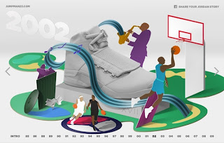
Eye-catching and smart, this celebration of Jordan (both the man and shoe) is thoroughly entertaining. The 3D elements are crisp and simple, which what makes them so stunning.
7. Large Photographic Backgrounds
Large scale backdrops will surge in 2011. These images will be high resolution, and covering the entire site.

This site adds playful animation with its grand scale imagery. Warning: auto-play music.
8. Adventurous Domain Names & Integration
Although not in the strictest sense a web design issue, look forward to seeing more creative domain names. The once-coveted .com domain has lost a lot of its appeal– primarily because you have to think up words in Na’Vi in order to find a domain that has not been thought up yet. 2011 will see a more wide-spread venture away from .com and into more whimsical domains like .me or .us. Think of the possibilities and scoop it up before it’s gone.
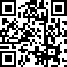
9. QR: Quick Response
If you have noticed those square barcodes popping on business cards, magazines or else where, you may already know that they are a hot trend for 2011. How exactly does it translate into web design? Amazingly well, in fact.
The barcodes are called QR, short for Quick Response. Simply take a photo of the unique barcode with your camera phone. Like magic, your phone will call up the website associated with said barcode. The beautiful thing about QR is that you can use it in a myriad of ways.
2011 is all about mobility and it will be smart to take advantage of this new medium.
10. Thumbnail Design
The ever-enterprising folks at Google have introduced the average user to thumbnail browsing. Gone are the days of clicking through to see the content of a website. These days, you just click on the magnifying glass and hover (assuming you’re not on a touchscreen). Magically before you is a glimpse of what waits on the other side of your click.
If your design is Flash-based, that is definitely going to be a problem. The preview will not display those elements of your design.
As the average internet user becomes more surfing-savvy in 2011, expect to see more people navigating by these means. It is just too great of a temptation not to judge a site by its thumbnail.
11. Constant Connection/ Life Stream
Last, but certainly not least, is the focus on constant connection in web design. The internet is, by nature, a sterile environment, and we make it human by sharing our lives in an open forum. Expect to see more intimacy through the form of lifestreaming. Personal blogs and portfolios in 2011 will prominently feature live Twitter feeds (not just a link to the Twitter page). People will let you know where they are at any moment of the day via Foursquare. In fact, expect to see a dedicated lifestream for all of one’s online activity. 2011 will definitely bring out our inner, creepy stalker, no doubt about it.